Autonomy at scale, engineered for two product ecosystems with a design system family.
Separate design systems unified into one coherent family.
Design systems benchmarked to ground the new structure.
Technology-team members surveyed to shape it around real use.
Project Overview
Project Overview
The problem
One B2B desktop web app had a basic pattern library; a responsive, mobile-heavy B2B2C app had no system framework at all. With no centralised, discoverable repository, UI components drifted apart across products. The existing system's atomic-design structure compounded it: teams routinely stalled classifying elements as molecules or organisms, turning a taxonomy question into an operational bottleneck.
The business objective
Architect a cohesive family of design systems that addressed the unique responsive needs of the B2B2C platform while aligning it with the B2B app. The ultimate goal was to eliminate duplicate work, drive cross-functional autonomy, and scale design-to-development velocity.
My role and scale of ownership
I directed this initiative end-to-end. I aligned stakeholders with competing views on the investment and secured executive backing, then ran the full design lifecycle: planning, user research, industry benchmarking, information architecture, component mapping, wireframes, mockups and prototyping. I championed a unified component language and contribution model across UX and engineering, handling the technical handover and setting up the frameworks to measure the system's impact.
How I got from internal research to engineering velocity
Discover
- Ran a kickoff workshop to align stakeholders and justify the investment.
- Researched with users through expert interviews plus a survey to 100+ members of the technology team on the existing system.
- Benchmarked 60+ design systems in the market.
Define
- Translated research into a living user-stories catalogue.
- Audited and card-sorted the un-systematised product's components.
- Defined a shared categorisation, navigation structure, and a design file architecture across the family.
Design
- Moved from low-fidelity navigation wireframes through a coded prototype to branded high-fidelity mockups.
- Aligned components across both systems for consistency and accessibility.
- Codified development guidance such as code snippets and implementation tables.
Deliver
- Validated the experience through usability testing before build, with a PM assisting to reduce bias.
- Refined the concept against findings.
- Handed a structured, documented system to engineering to streamline implementation.



Execution
Execution
Understanding the problem
This company had two main products in place: a B2B web app focused only on desktop breakpoints, and another B2B2C fully responsive web app with a considerable mobile focus. The first product had a design system in place that I started and more members of the UX team contributed to as designers joined the project. This was implemented initially as a pattern library with complementary design principles and guidelines documented on Confluence.
The fully responsive web app, on the other hand, did not have a design system in place, and a separate design system was required with its own specificities regarding breakpoints and customisation. The main goal of this project was to define one while aligning it with the existing system, making sure a cohesive family of design systems was in place.
Discovery and definition
Planning the work
Before anything else, I drafted an initial plan that I reviewed with the UX team, product manager and other stakeholders to make sure we were all on the same page regarding the activities that should take place. The activities planned ranged from analysis of existing systems, auditing, research, and components and principles mapping, to definition of the design system navigation structure both in Sketch and in the live repository.
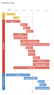
Planning of the first phase.
Kick-off workshop
We started the project with a workshop designed to get alignment and buy-in from stakeholders, some of them yet keen to understand the value of investing in a design system family. To achieve this we:
Reviewed past implementations across two projects: one created without a design system versus another created using a concept prototype of a design system / pattern library. We gathered insights from all stakeholders on the advantages of a shared repository of elements to scale design and implementation, justifying the investment to more sceptical stakeholders.
Ran a brainstorm session so all stakeholders could agree on the goals and audience the design system should reach, alongside an exploration of what a high-level phased approach to the technical implementation could look like.
From there we agreed the system's goals: scalability, consistency, autonomy, collaboration and alignment. We identified primary users (software engineer, software architect, delivery lead, quality engineer) and secondary users (UX designers, product managers, third-party providers, external agencies, new joiners), and phased the work accordingly: a pattern library for primary users first, then a second phase elevating it into a full design system with how-to-use guidance, do's and don'ts and implementation examples.
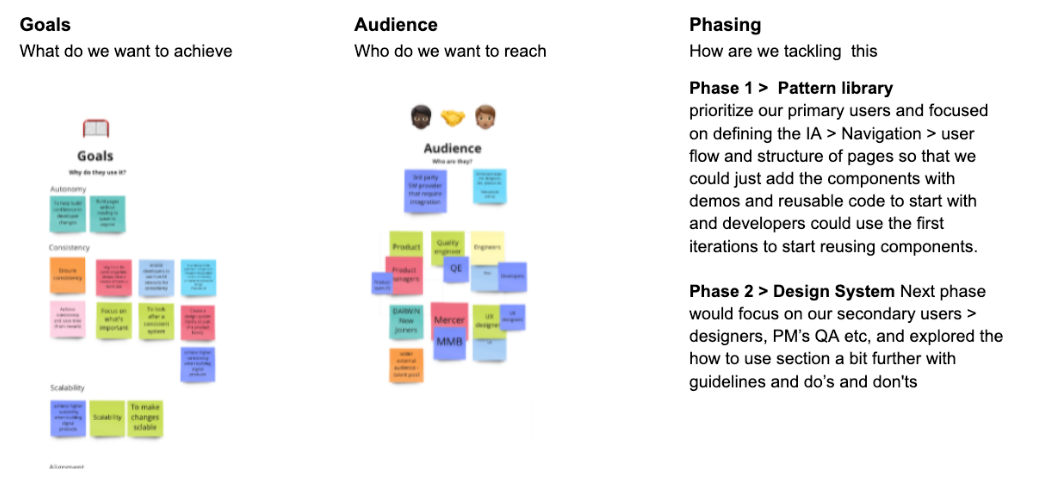
Snippets from the remote workshop we held to achieve alignment.
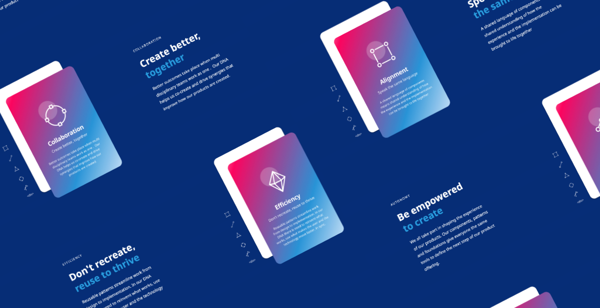
Design system principles guidance extracted from the design workshop later materialised into the final principles.
Collecting and analysing data
Once the foundations were set, we moved on to researching with users and mapping the landscape of other design systems to understand the main patterns used by repositories created by other technology players.
User research
Expert interviews: unstructured interviews with two lead developers, plus insights from the six UX designers using the existing atomic-design prototype, surfaced what was working and what was not in the navigation, components and overall approach.
Questionnaire survey: using the live pattern library from our desktop product as a baseline, UX and tech drafted a survey to 100+ members of the technology team, sampled by role (software architect, delivery lead, quality engineer, software engineer).
The 23 replies, spanning several regions, showed us how to improve the structural approach, navigation and search, and the implementation detail around code reusability.
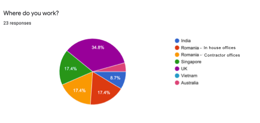
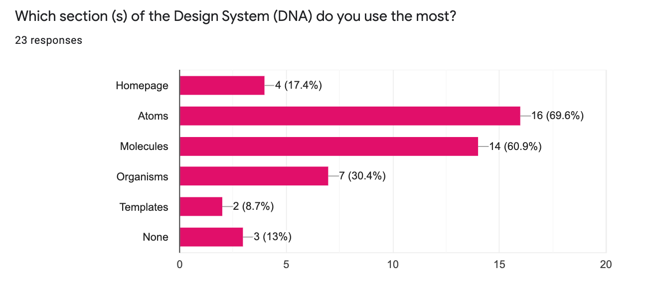
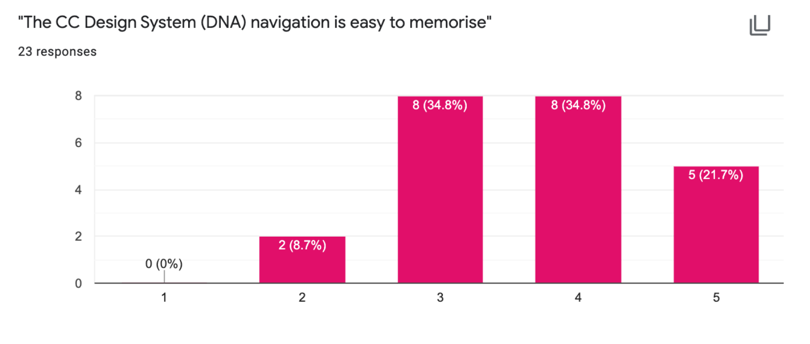
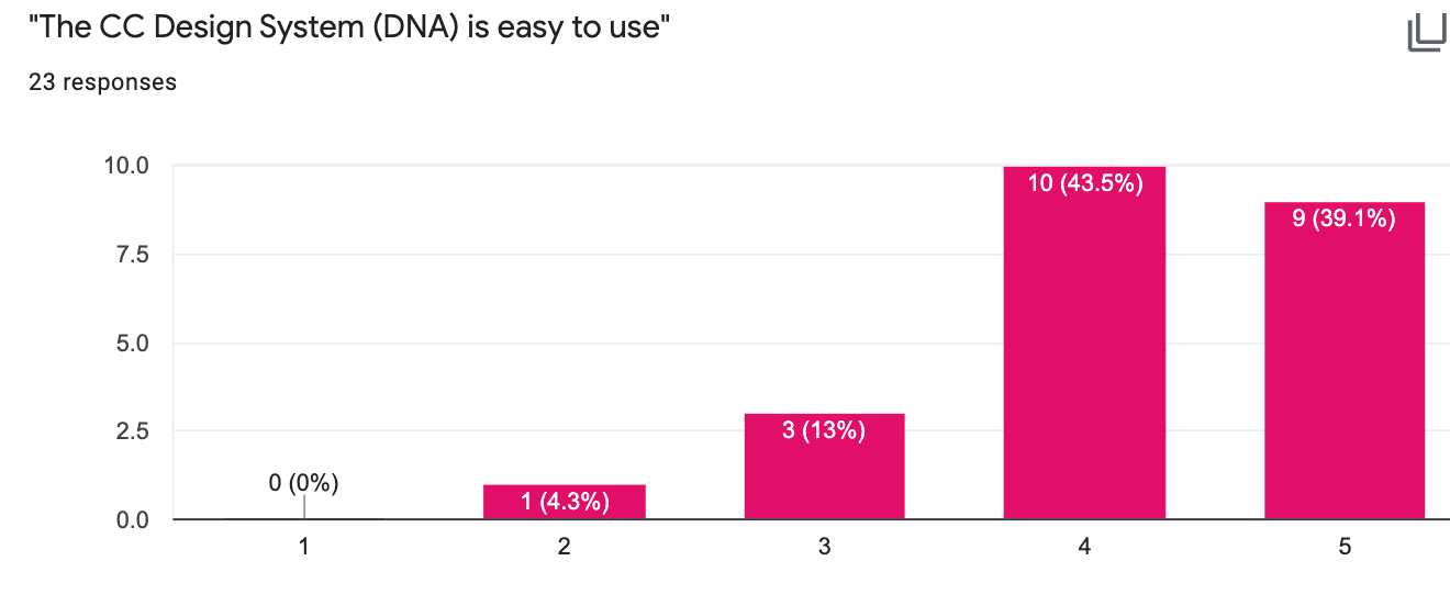
Quantitative and qualitative survey results across regions and roles.
Overall the quantitative assessment showed a positive response to the navigation system and components available. The qualitative data, however, surfaced some interesting takeaways:
- Confusing terminology (molecules and organisms). Many users across tech and UX found the atomic-design metaphor great in principle but hard to apply day to day: often unsure whether to classify a component as a molecule or an organism. This made elements harder to find and reuse, and frequently required a design committee to agree on classification.
- Missing features, namely: keyword search showing code examples for components; code snippets next to each element; HTML / framework code examples (e.g. angular-material); more guidance on where and how components should be used; links to real live implementations; and information on paddings and margins.
User stories
The research insights from the survey and interviews formed the foundation of our user stories page. This page evolved with the project: gathering insights from design reviews and alignment sessions: and became a centralised area to catalogue needs per section, track whether solutions had been validated with users, and prioritise needs for development.
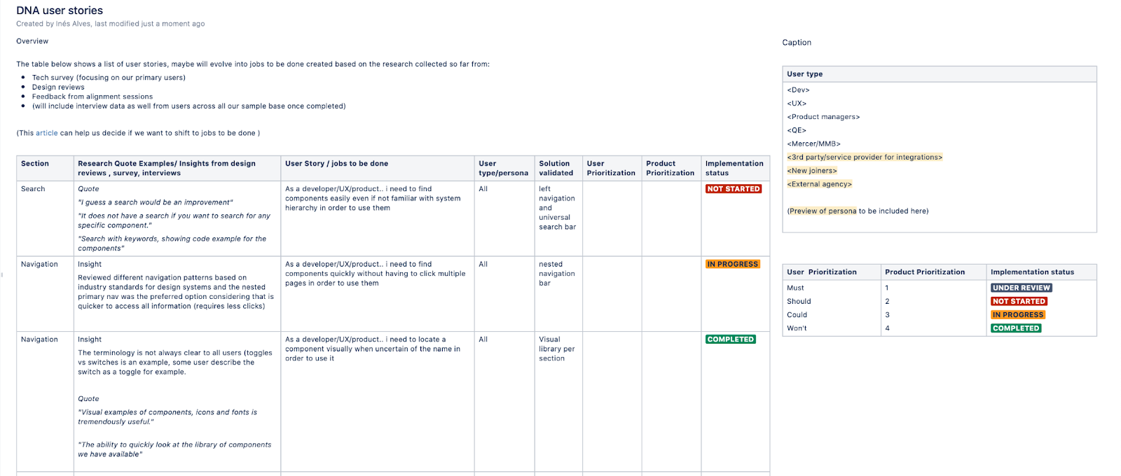
High-level view of user stories mapping and phasing.
Benchmark research / competitor analysis
In parallel with user research, we analysed other design systems in the market: 60+ in total: to understand their information architecture and categorisation, navigation patterns, and the range of features that went beyond a pattern library and how-to-use guidelines.
A key aspect I wanted to assess was navigation, given that the atomic-design approach in our first concept proved confusing (particularly the molecule/organism distinction).
To influence stakeholders initially sceptical about the investment, I showed how major players and products we use every day rely on their own design systems to streamline and create some of the best products in the market: paired with the analysis of development progress across projects with and without design systems.
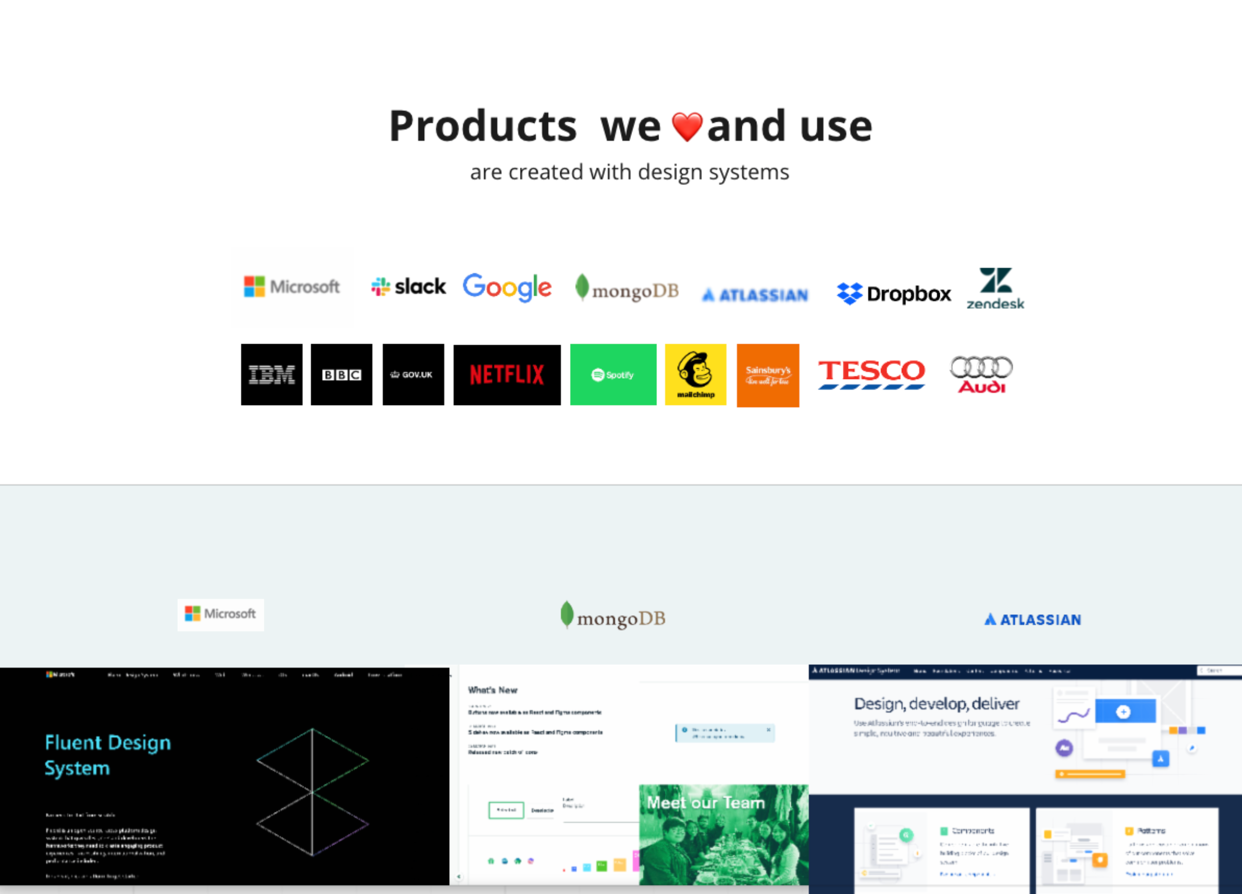
Authority bias: a behavioural principle applied in the workshop to show value to stakeholders.
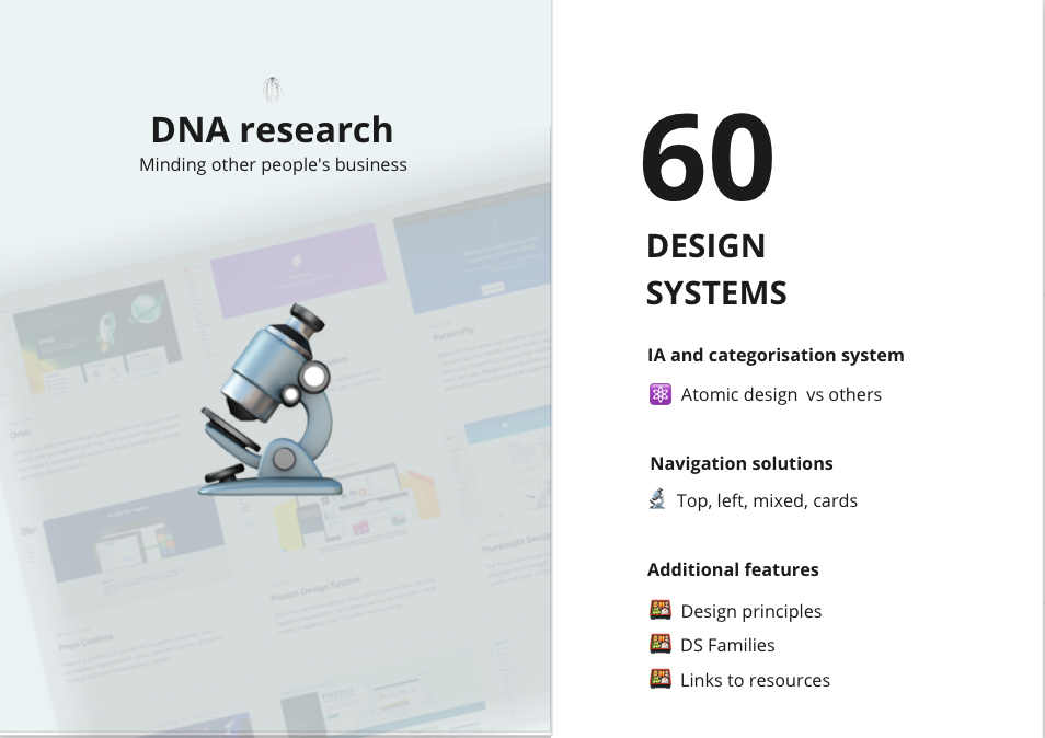
Overview of DNA research. Emojis from emojipedia.org.
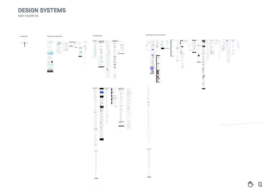
Some of the design systems analysed.
The patterns discovered
It was immediately obvious that most systems did not follow the atomic-design approach. While some insur-tech players like AXA used it clearly, references such as Atlassian and GOV.UK followed what we identified as the most common approach: “Foundations”, “Components” and “Patterns”.
Navigation solutions ranged from a primary left navigation with progressive disclosure, to top navigation, or a hybrid of card layout and top navigation: the first being the most common.
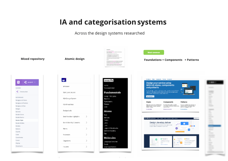
The patterns discovered.
Ideation and prototyping
Component audit
For the second project: created without a design system: we ran an audit to map the existing items, followed by a card-sorting activity. This grouped items under the right categories and helped define a navigation system that could be shared across both design systems in the family.
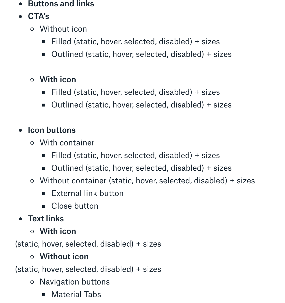
Component audit and card sorting to inform a shared categorisation.
File structure and IA
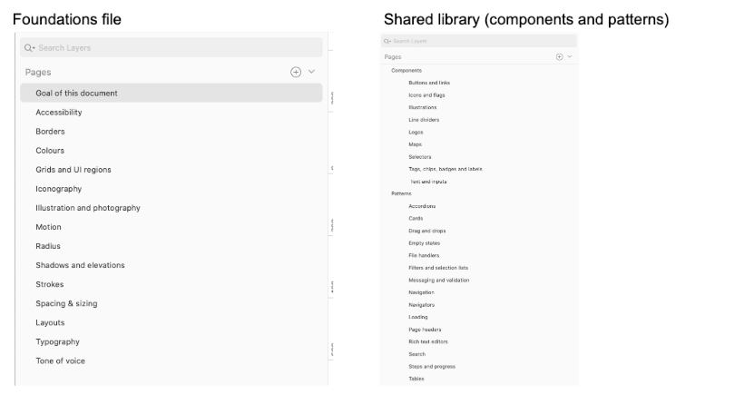
Alongside the navigation of the live repository, another concern was navigation across our Sketch design library files for the UX team. We had struggled with library file sizes in the past, so to keep them manageable we split frequently used files from those updated occasionally:
- Principles and foundations file: a separate Sketch file requiring less frequent updates and not needing to be linked into working files.
- Components and pattern library: a library of symbols to be linked and regularly updated, as these elements are reused in mockups and wireflows.
Components: alignment and accessibility
In parallel with defining the navigation, I mapped the existing components of the second design system and the first one, and aligned components across the two. A round of iteration made components as consistent as possible across applications, and aligned with accessibility standards.
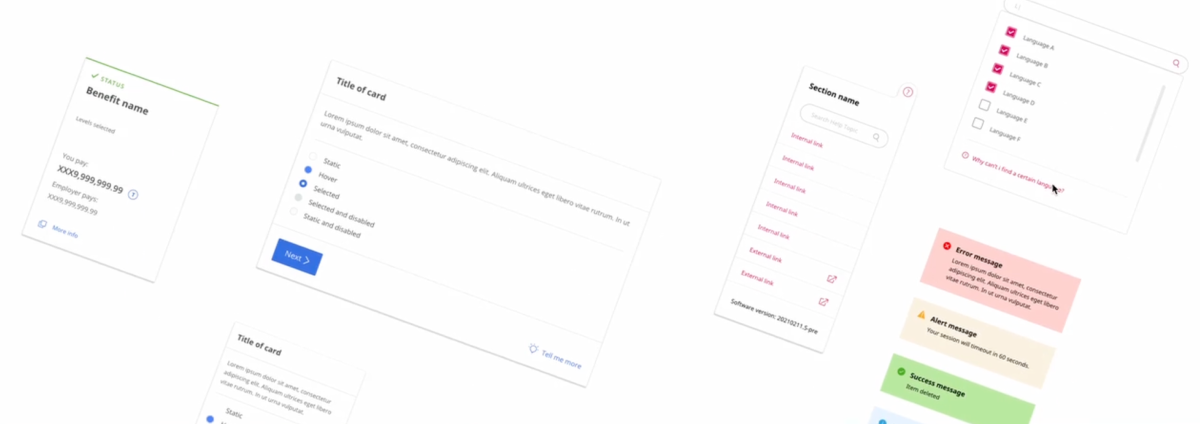
Examples of components across the 2 design systems.
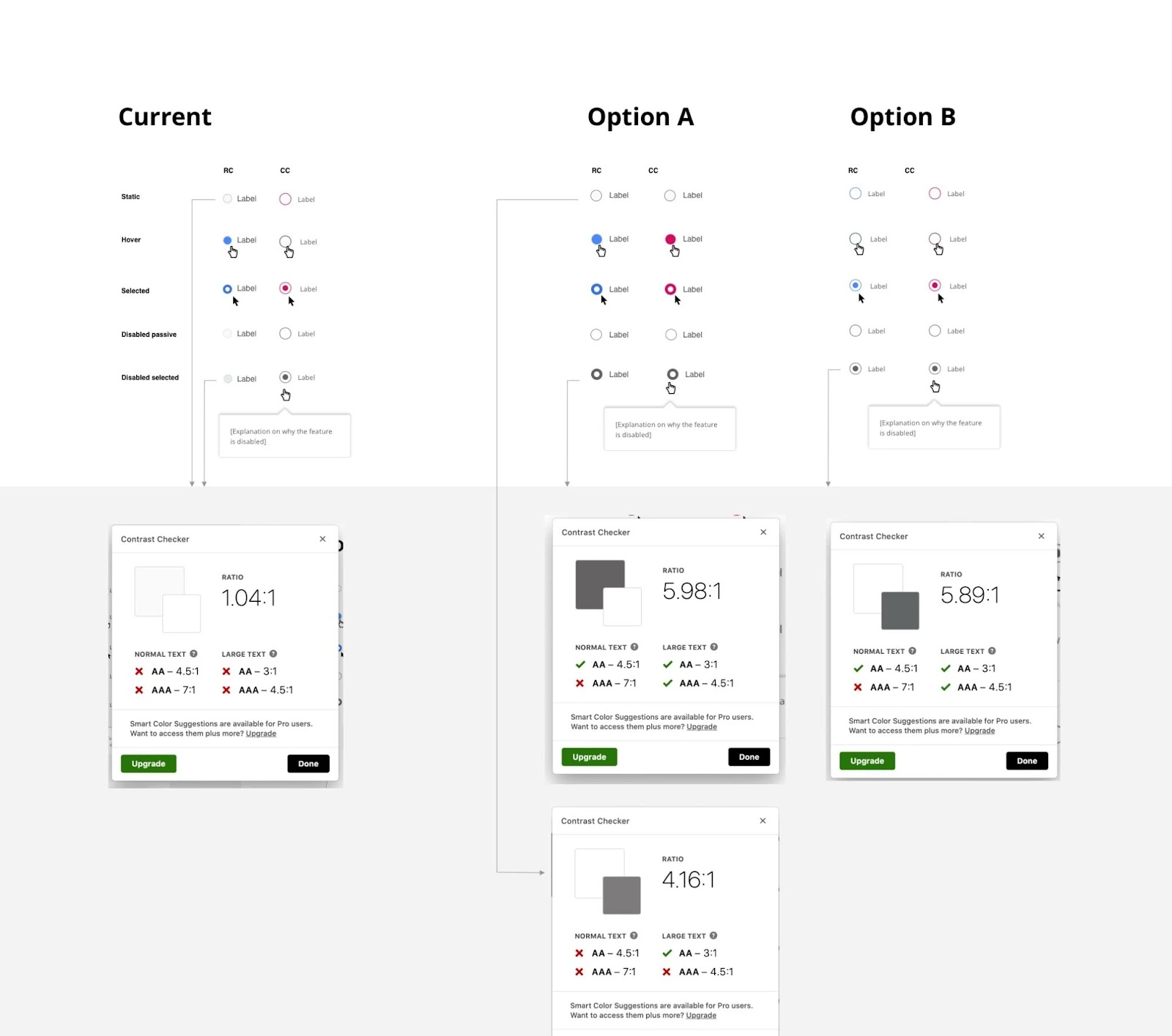
Aligning interaction patterns and colour-contrast levels across radio buttons between the two design systems.
Generating concept ideas
Wireframes, prototype and design reviews
I drafted the first navigation wireframes from the research insights and ran remote design reviews with UX and development. With that feedback incorporated, the development team built a low-fidelity coded prototype we could test the navigation and interaction elements against. Further reviews with stakeholders drove quick changes to the navigation and features, including the floating navigation and progressive disclosure of content (component code versus implementation table), with weekly alignment sessions tracking progress and setting milestones against what was being implemented.
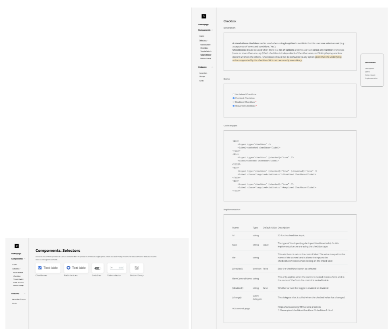
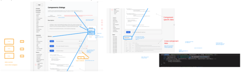
Annotations of feedback from a design review.
Mockups and prototypes
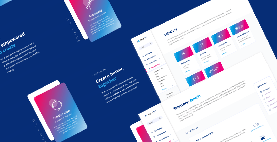
I elevated the iterated wireframes to mockups, following the branding and visual language of the company. Typography styles for titles and colour pairing were key aspects of the branding applied to the design system. I defined the concept for the branding around the idea of a “universe of components” within the DNA.
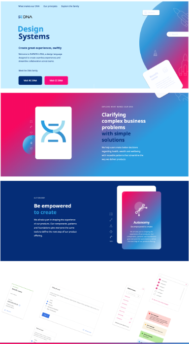
Landing page: design system family.
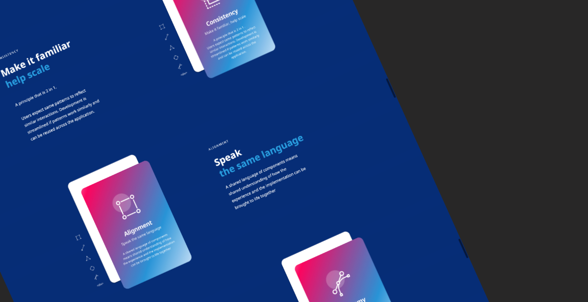
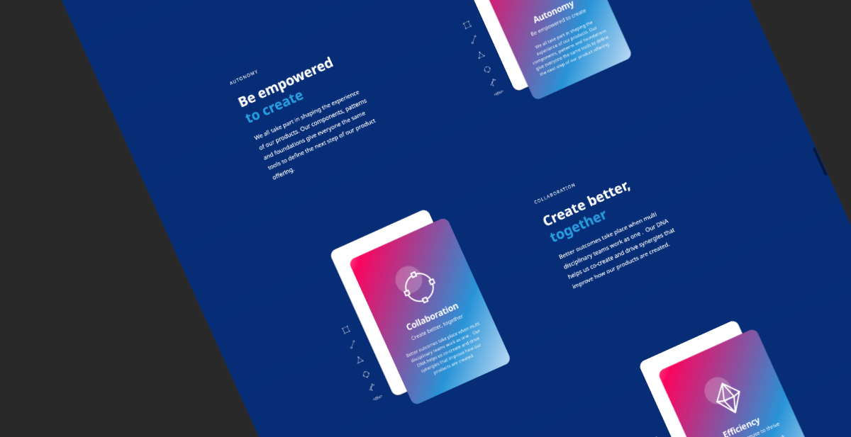
Design system principles detailed on the landing page.
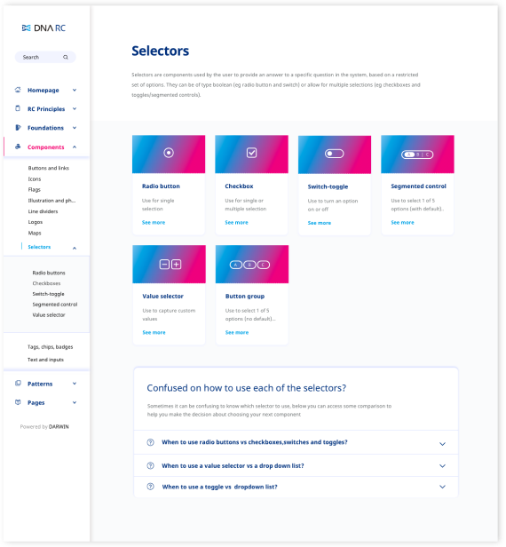
Example of a component category page with help section.
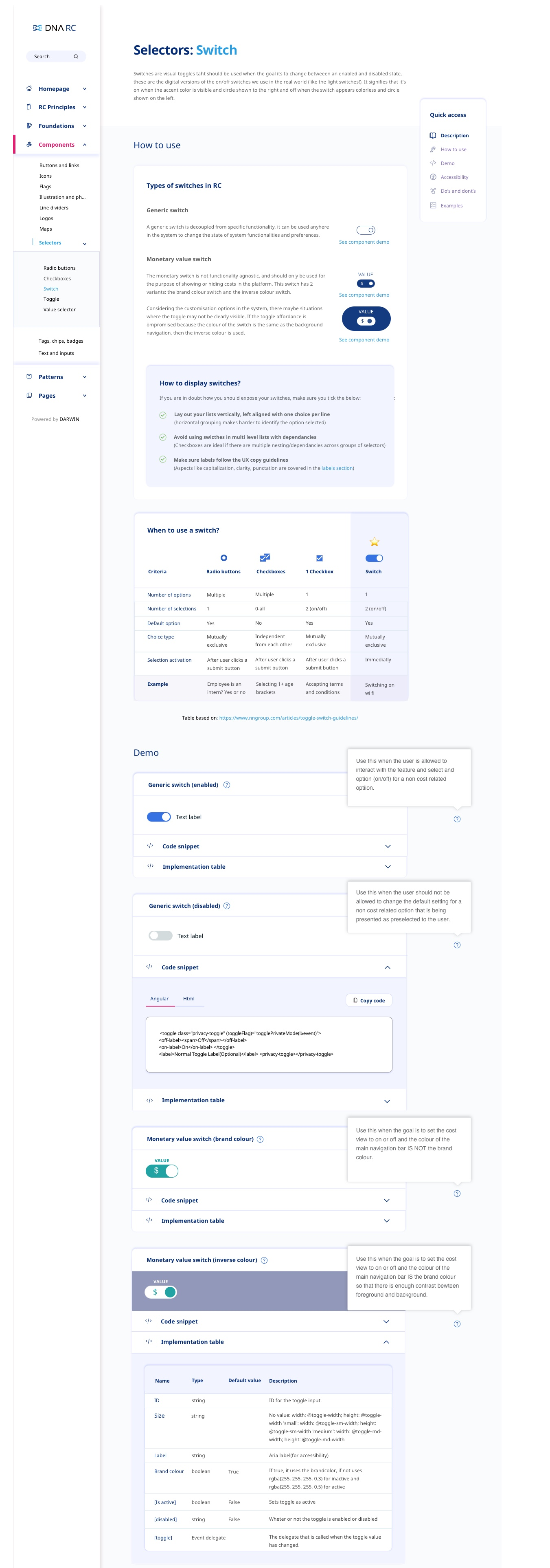
Example of a detailed component page: switch.
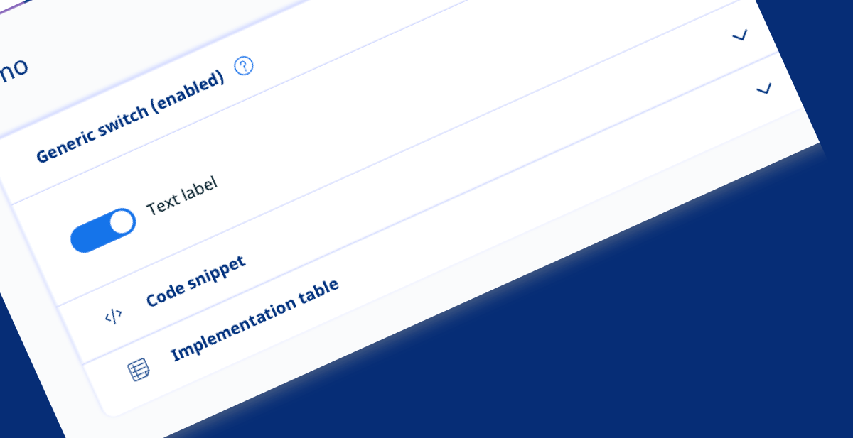
Focus on development guidelines.
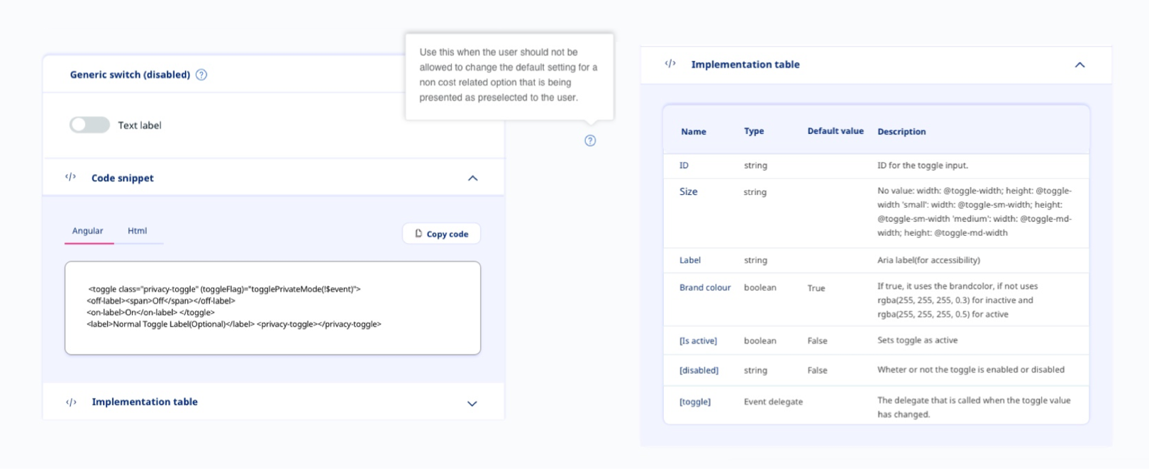
Comparison view: code snippet and implementation table.
Evaluating concepts with testing
Finding usability issues
I ran usability testing to gather feedback and find usability issues before development, with one PM assisting to reduce bias. The goals were to validate the initial concept and understand usage of the repository components directory (how users find the exact elements they need) and the code-snippet exploration.
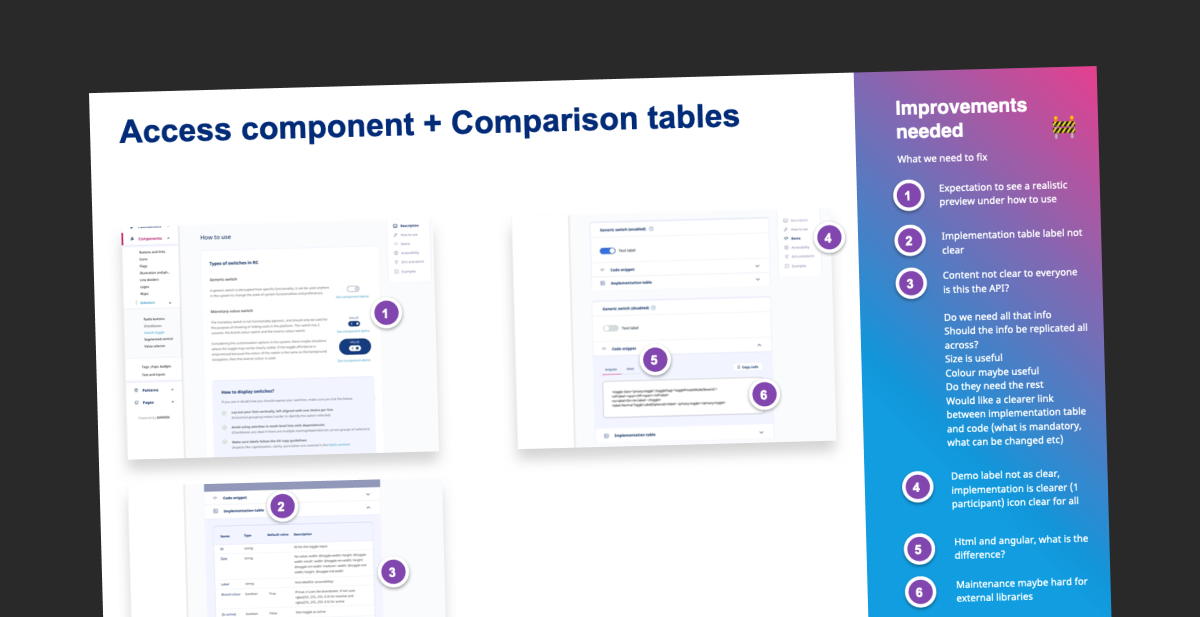
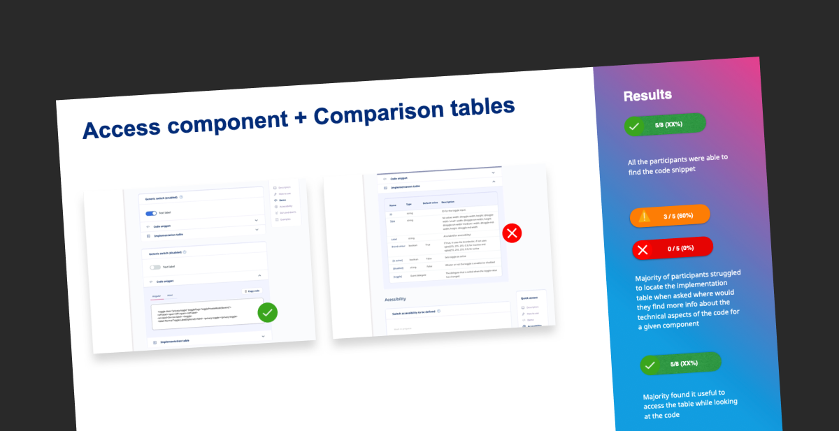
Usability testing of the access component and comparison tables: issues logged and task results.
Key findings included:
- The homepage and principles needed a clearer explanation of the approach.
- Guidelines and principles used confusing terminology.
- The search pattern needed to match additional criteria and improve progressive disclosure.
- The implementation table needed revisiting.
- The comparison table needed revisiting.
- The relationship between the components > selectors area and inputs needed to be revisited.
Delivery and handover
I streamlined implementation by handing over fully specified components and guidelines to the development team, ensuring a smooth transition from design to build.
Each component shipped with its types and hierarchy, every interaction state, sizing and padding rules across desktop, tablet and mobile breakpoints, and notes explaining when a variant should and should not be used. Specifying behaviour at this level meant engineers were not left interpreting a static mockup, and the same rules held whichever product picked the component up.
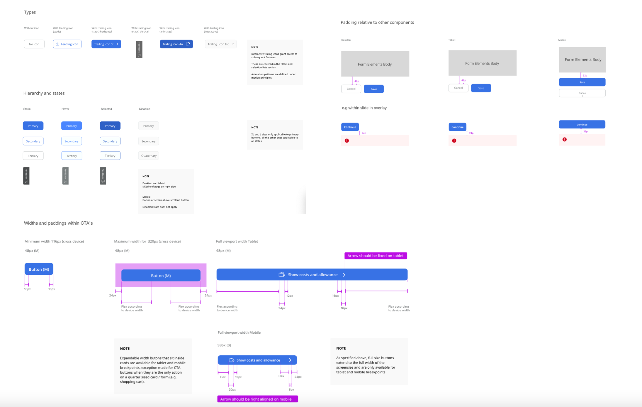
Handover specification: types, hierarchy and states, and widths and paddings across breakpoints.
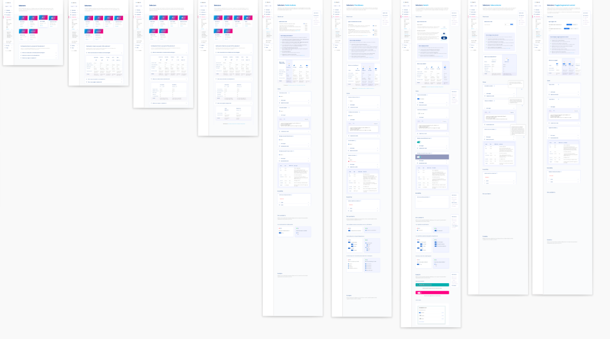
Alongside the specifications, I delivered the documented component pages, each pairing a live demo with a code snippet and an implementation table listing every property, type, default value and description.
The design system landing page tied the family together, introducing the principles and routing people into whichever system applied to their product. Together these gave design, product and engineering one shared reference, cutting the back and forth during build and giving the system a foundation the teams could keep extending.
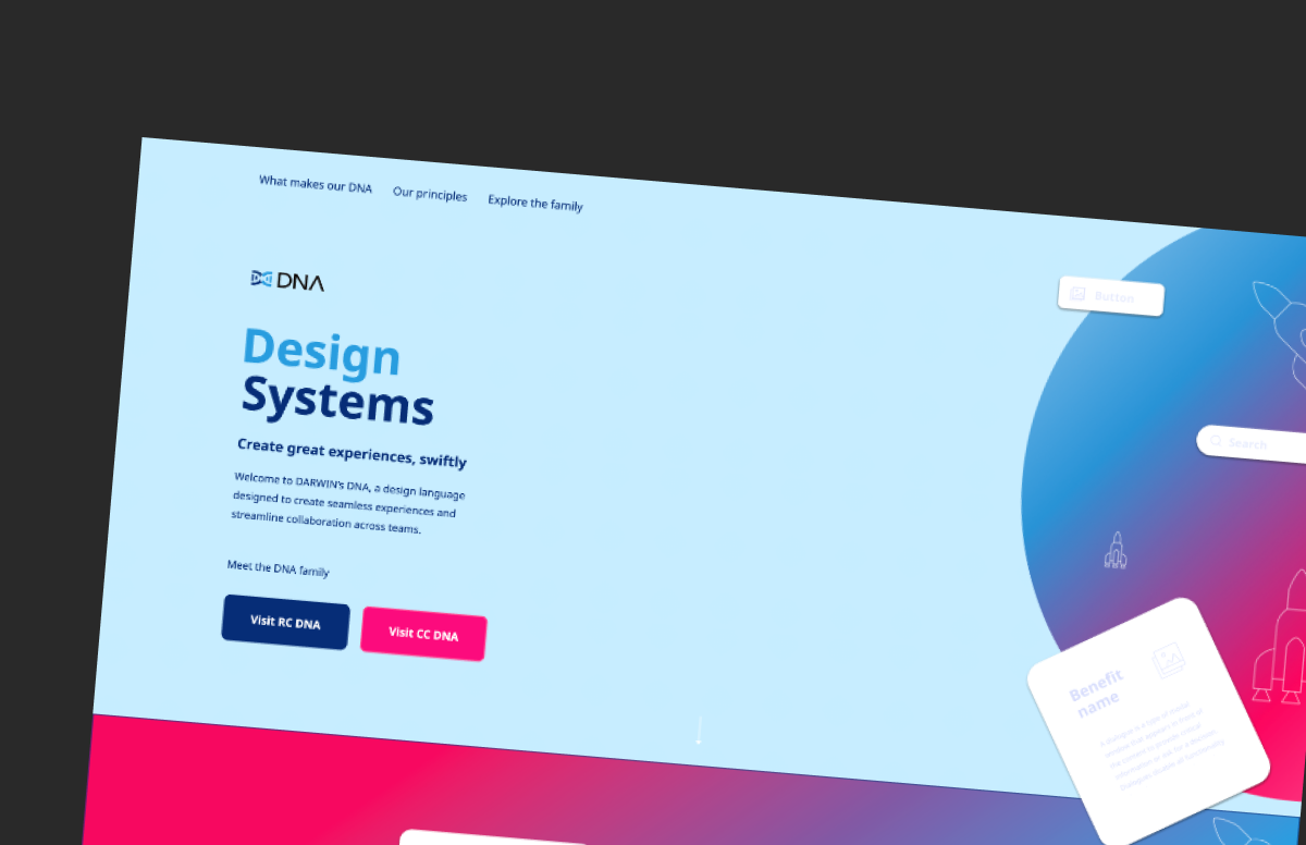
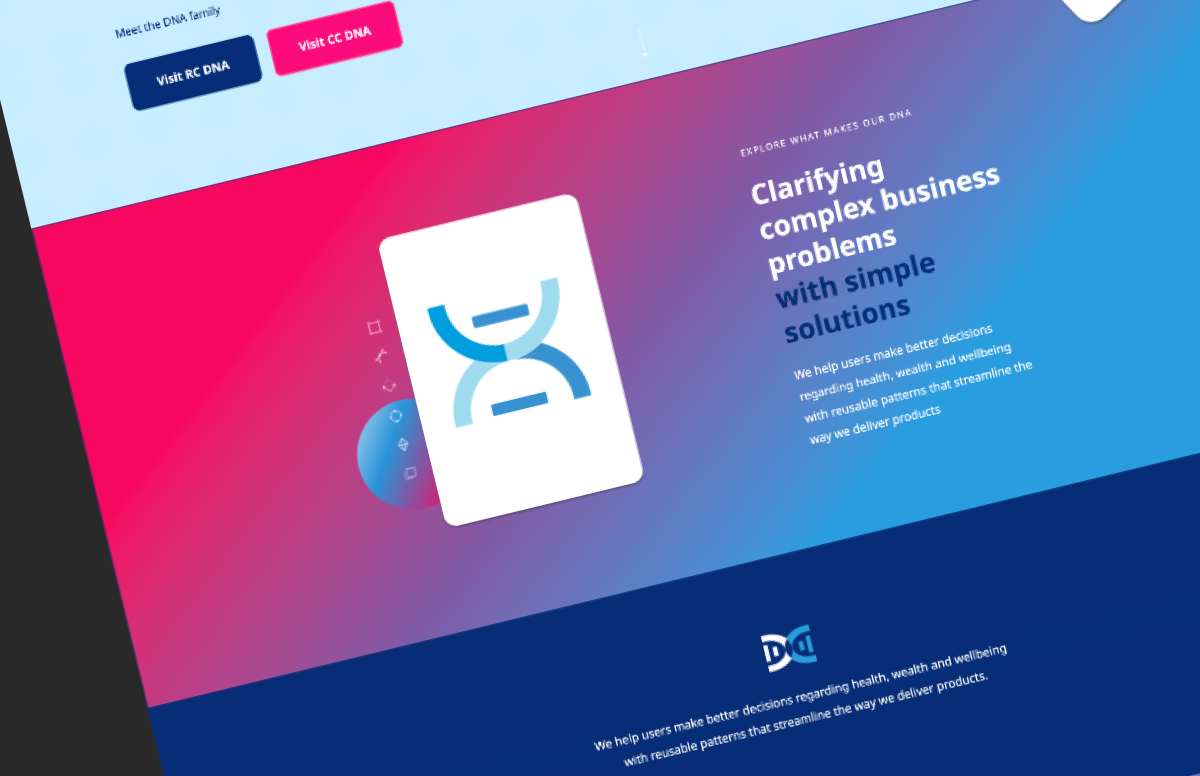
Handover materials: component specifications, documented component pages and the delivered design system landing page.
Results & Business Impact
Results & Business Impact
A cohesive, shareable design family
The project delivered a uniform categorisation system shareable across a cohesive family of design systems, so two products that had grown apart now drew from one consistent structural language.
Separate design systems unified into one coherent family.
Design systems benchmarked to ground the new structure.
Technology-team members surveyed to shape it around real use.
"This wasn't just a component library. The value came from winning support for an investment some stakeholders doubted, learning from a system already live in production, resolving a structural problem inherited from atomic design, and keeping two very different products coherent under one family."
A landing page that made the whole family legible
A design-family landing page helped users get familiar with all the design systems in the organisation from a single entry point, rather than discovering them piecemeal.
A user-centred navigation and visual categorisation
The delivered navigation let users locate information in a natural way, and a visual categorisation of components and patterns allowed people to visually search and identify the exact element they needed.
Usage guidance built into the system
Guidelines, comparison tables and visual do's and don'ts clarified best practices directly where teams worked, reducing misuse and the need for committee decisions.
Lighter, better-organised design tooling
Restructuring the component library files reduced the weight of the reusable libraries and made navigation across components far easier for the UX team, resolving a long-standing file-size problem.
A structural model users could actually navigate
Moving from the atomic-design molecule/organism split to a clearer, benchmark-informed categorisation removed a recurring source of confusion for both engineers and designers.
End-to-end ownership with the team
I carried the work from planning through handover, secured buy-in from sceptical stakeholders, integrated contributions across UX and engineering, and measured impact throughout, establishing the shared practices to maintain it.