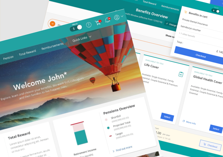
A cross-device cart that cut the steps to select benefits and gave employees access from any device.
Fewer steps to complete benefit selection with the shopping cart.
Fewer login-related customer support tickets after the password reset flow was fixed.
Employees able to select benefits on any device: desktop, tablet and mobile.
Project Overview
Project Overview
The user problem
Selection was desktop-only and ran one benefit at a time, so 2.5 million employees could only choose at work. Dependencies between benefits were invisible, and supporting flows such as enrolment periods and login were broken along the way.
The business objective
Rebuild benefit selection as a cross-device experience so employees can select on desktop, tablet or mobile, with dependencies and mutually exclusive options made clear.
My role and scale of ownership
I led UX on the portal experience from the point I joined through to a validated, multi-device Design System, including the initial audit. An agency had been on the project before I joined and set the initial brand baseline, with some early input into UX and discovery; from the point I took over, I owned UX throughout, including while they were still on the project, and managed that relationship. When they were offboarded, I took on UI as well, defining the responsive progressive disclosure patterns, and pitching for an atomic Design System.
How I got from a broken flow to a cross-device cart
Discover
- Analysed benefit access models and enrolment periods
- Audited broken login, dependant selection and allocation flows
- Audited single, cross and interdependent benefit selection
Define
- Mapped the information architecture behind single, cross and interdependent benefit selection
- Drew user flows for each selection scenario, including dependency and exclusivity rules
- Ran low-fidelity explorations to stress-test the shopping cart pattern before committing to it
Design
- Built wireframes and mapped how modules recompose across desktop, tablet and mobile
- Set guidelines and mapped recurring UI to reusable components
- Used that mapping as the starting point for an atomic Design System
Deliver
- Business expert reviews
- Moderated, task-based testing across breakpoints
- Delivered patterns into a multi-device Design System



Execution
Execution
The agency set the brand baseline, the foundational grid and content pages such as the homepage. I owned UX throughout the engagement, focusing on selection experiences, and took over UI as well once the agency rolled off the project, carrying their foundations forward into the responsive patterns below.
Auditing the existing experience
Before proposing a new flow, I mapped where benefit selection already broke down. Selection ran on desktop only, one benefit at a time, so 2.5 million employees could only choose while at work. Dependencies between benefits were invisible.
Supporting flows such as enrolment periods and login had quietly stopped working along the way, and I mapped both the original and the ideal IA, from login through to every under-benefits section, tracing navigation links, empty states and available actions so dependencies and gaps were visible before any redesign began.
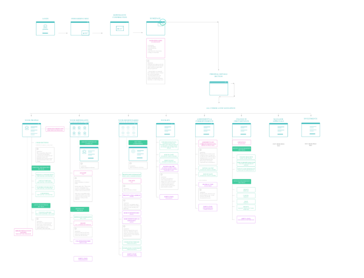
Full information architecture map, from login to under-benefits navigation
The original experience only ran on desktop, showed one benefit at a time with no view of how it affected others, and required a working login and enrolment period that had quietly broken along the way, before any of the selection work began.
Redesigning the experience
With the broken flows mapped, I designed a shopping cart paradigm to hold multiple benefit selections at once, surfacing dependencies, changes to existing selections and mutually exclusive options as they happened, rather than after the fact.
This replaced the one-benefit-at-a-time model with a single flow covering single, cross and interdependent selection. I mapped the detailed logic behind the notification panel and benefit selection, tracing every decision point across login, window states, selection and checkout so engineering had an unambiguous spec to build from.
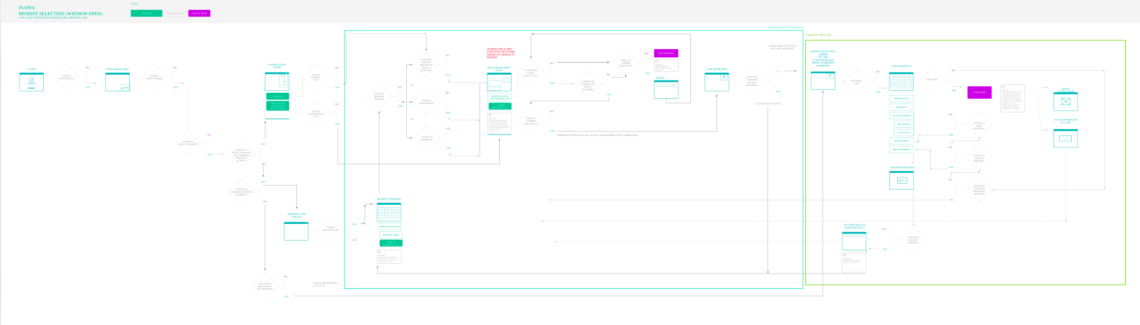
User flow: benefit selection, shopping cart and checkout, with one window open
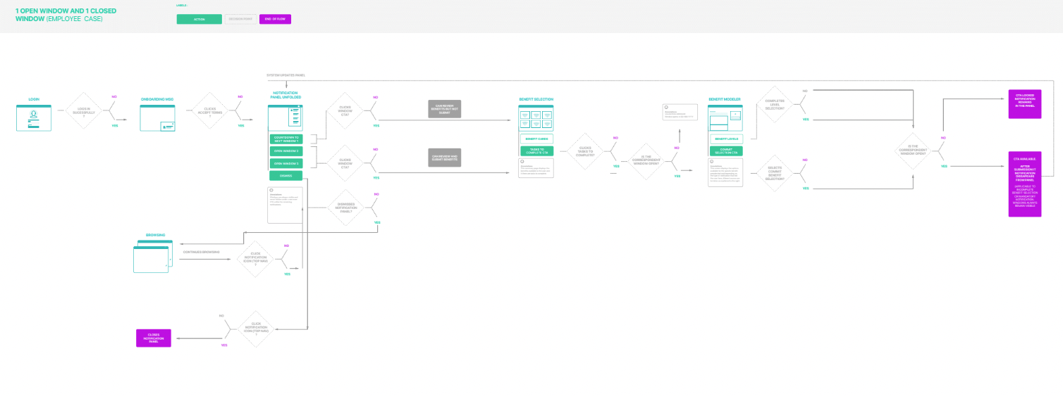
User flow: one open window and one closed window (employee case)
Reducing the steps
Consolidating the selection, dependency and checkout logic into one flow cut the path from 34 steps to 23, removing the re-entry and confirmation loops the old one-benefit-at-a-time model forced on every dependent or cross-cutting choice.
Each pass through a benefit repeats the same discovery-and-backtrack pattern: a pink step sends the employee out to dependants or beneficiaries, then back again, before enrollment can continue.
Show steps+ Hide steps-
The three backtracks collapse into green in-context nudges on the first pass only - dependants, beneficiaries and allocation are resolved without leaving the flow. 23 steps across all 3 benefits, single pass, no backtracking - the 2 in-context nudges on the first pass replace the round trips to dependants and beneficiaries.
Show steps+ Hide steps-
A single action moving the flow forward.
Original flow only - leaves benefits to resolve dependants or beneficiaries, then returns.
Redesigned flow only - resolves the same dependency without leaving the page.
Separates the passes through each of the three benefits.
Low-fidelity explorations, wireframes and responsive module mapping
I hand-sketched multiple options across breakpoints, including two competing progressive disclosure options early on: one moving through navigation tabs, the other through nested sub-panels, so trade-offs in how much structure to show at once could be discussed before committing to either. After cycles of reviews with stakeholders I then keyed each screen's modules (B through F) so the same benefit configuration page could be traced consistently from desktop through to mobile, showing which areas collapse, combine or drop away at each breakpoint.
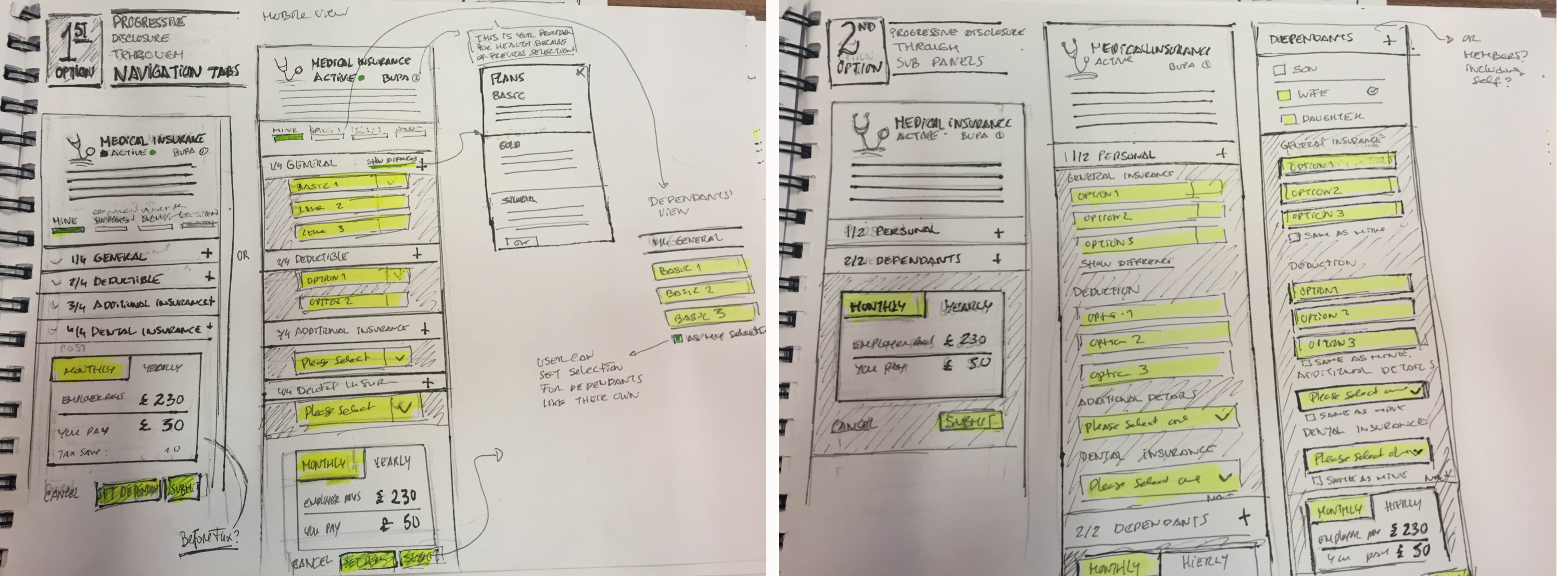
Option 1: progressive disclosure through navigation tabs · Option 2: progressive disclosure through sub-panels
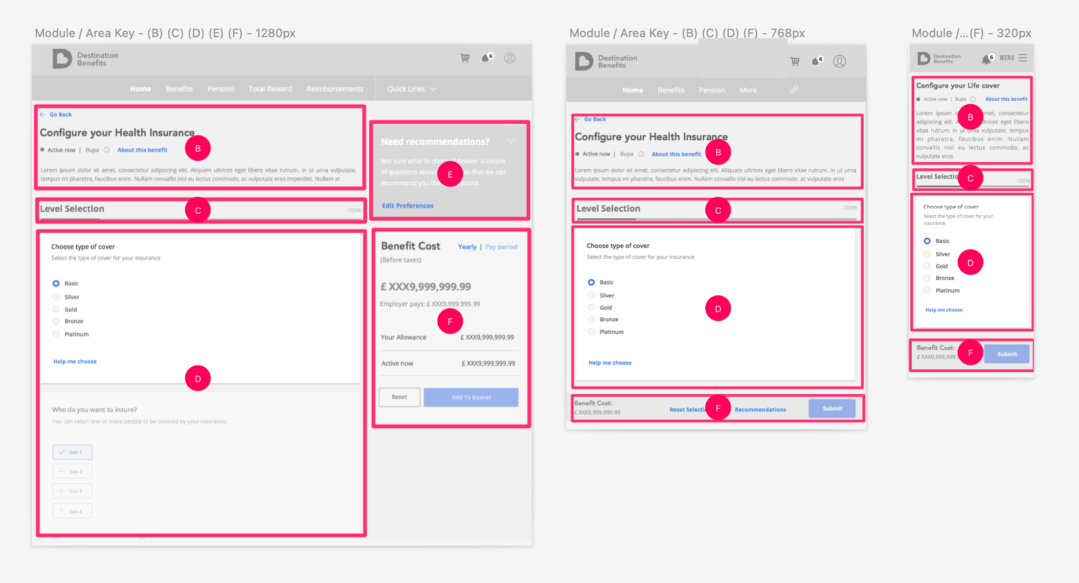
Wireframes: module and area key across desktop, tablet and mobile
High fidelity designs, component mapping and guidelines
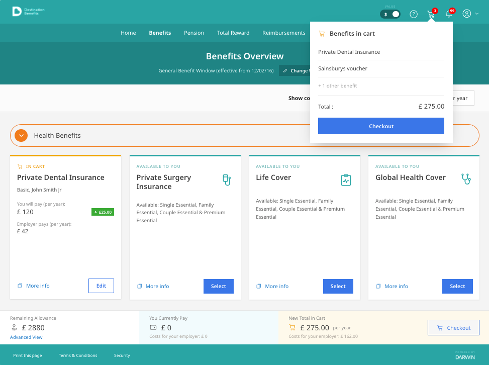
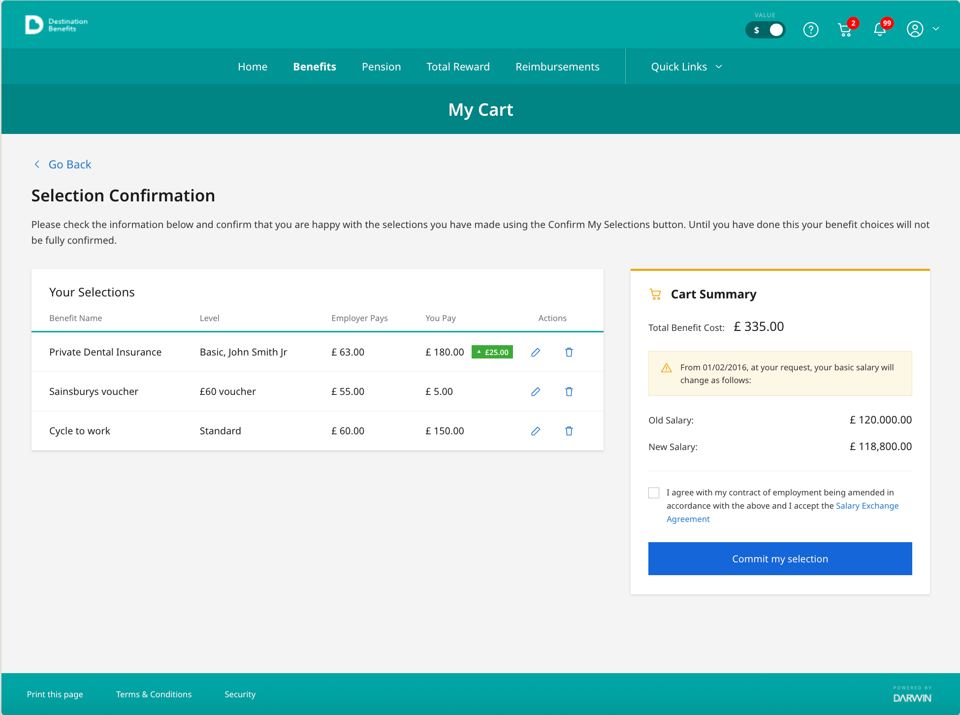
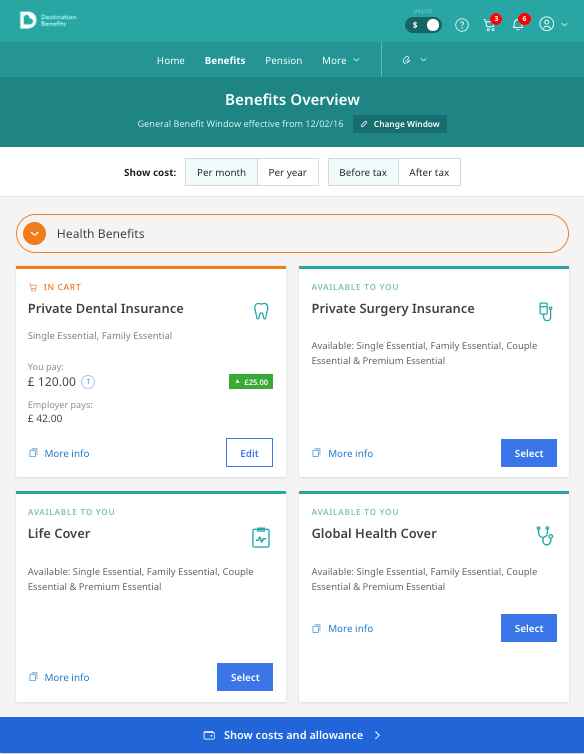
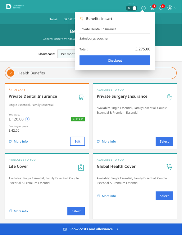
I built responsive progressive disclosure patterns so the cart, dependency states and allocation screens collapse cleanly from desktop through tablet to mobile, then formalised those patterns into the components that became the project's Design System.
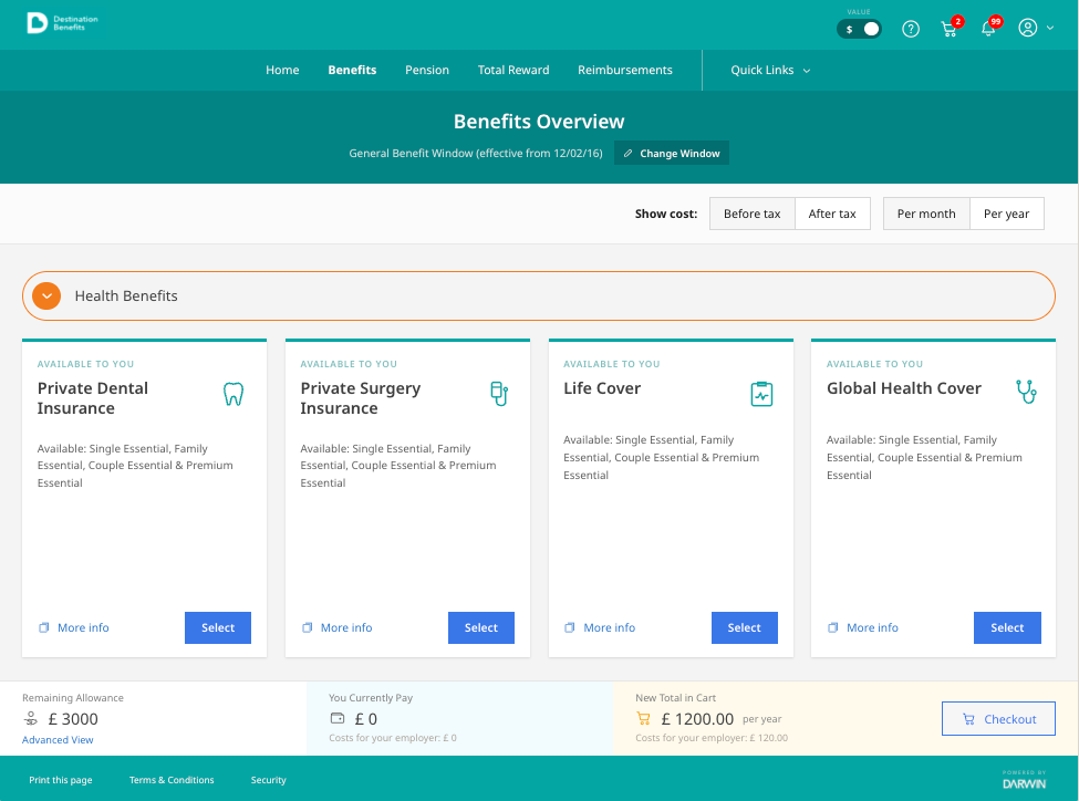
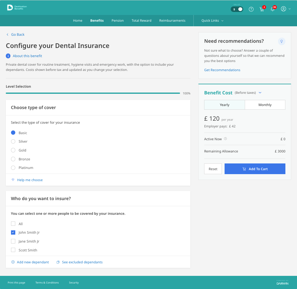
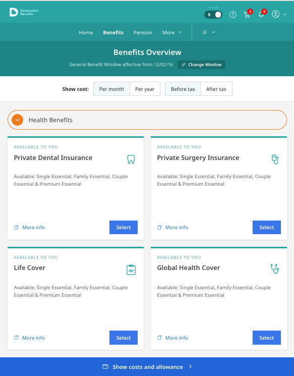
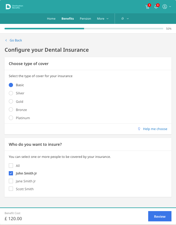
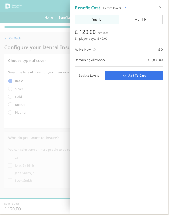
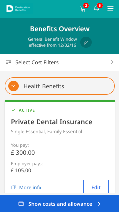
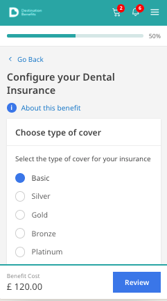
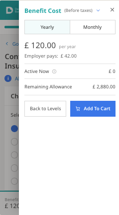
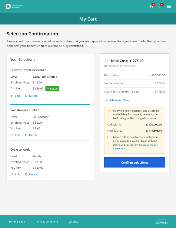
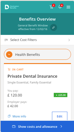
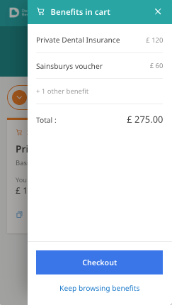
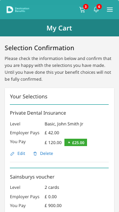
The cart itself moved with the breakpoint too: a compact popover from the nav on desktop and tablet, and a full-screen page on mobile, with the cost panel sitting beside the form on desktop, sliding over it on tablet, and settling fixed to the foot of the screen on mobile.
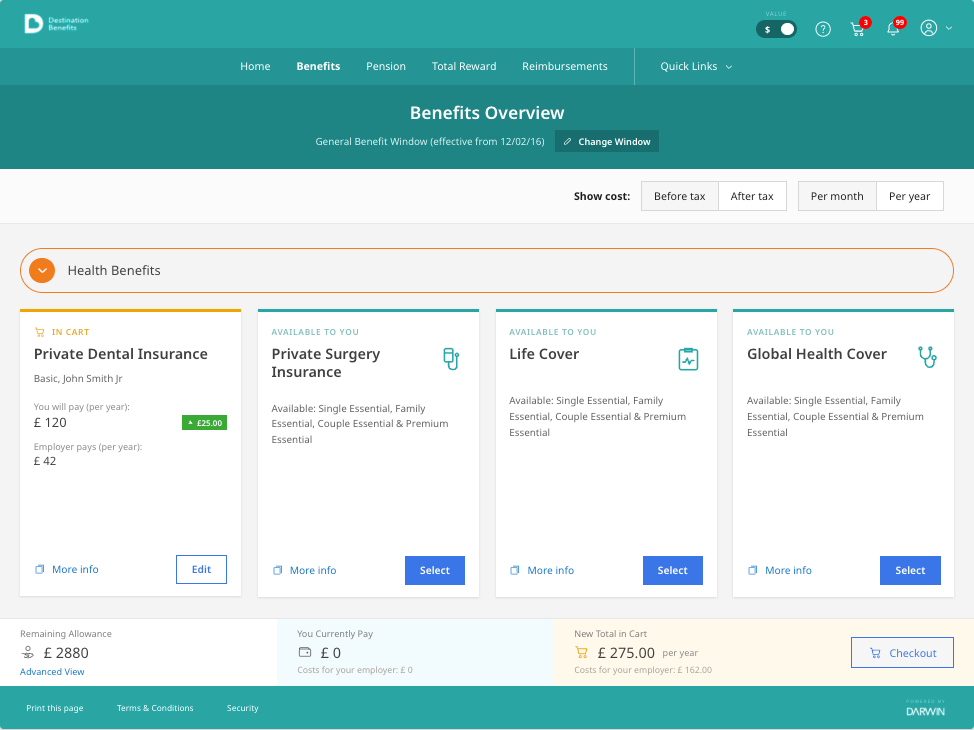
Beyond the cart
Alongside the cart and selection flow, I designed the other experiences that fed into the same benefits portal: beneficiaries allocation, dependants, employee details, discounts and the password reset experience, each built on the same responsive foundations so the whole platform, not just the selection flow, held together as one experience.
Password reset was one of the flows quietly broken along the way: there was no way to show or hide a typed password to check it, and the guidance for building a valid one wasn't clear. I introduced a show/hide toggle, a password creation flow with key criteria matched to type as the employee typed, and a clear reset flow for when they got locked out.
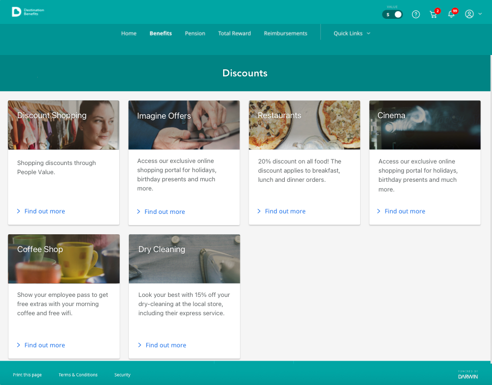
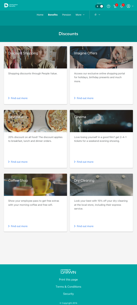
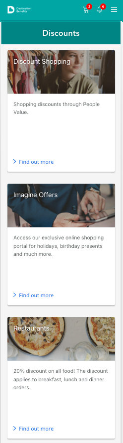
Component mapping
I mapped how single and multiple selection components needed to flex as interdependent levels and hierarchies grew, from up to five dependants to more than five, to set guidelines for when a screen takeover or modal was needed instead.
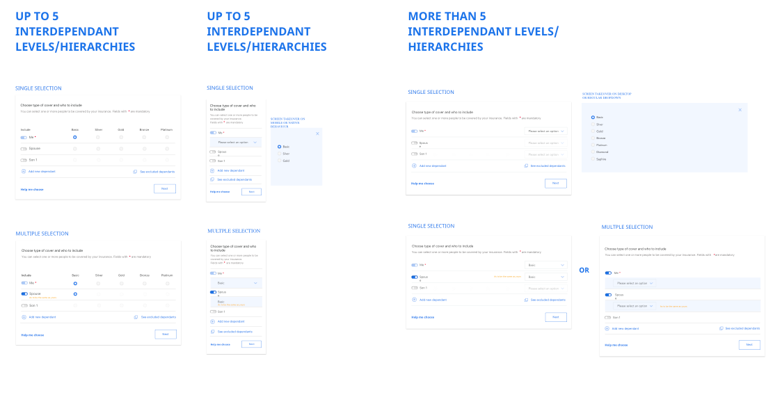
Component mapping and guidelines for interdependent selection hierarchies
I built a module asset canvas for the benefit cost component, tracing its old and new states across smartphone, tablet and desktop breakpoints and every variant needed for review overlays, floating summaries and alerts.
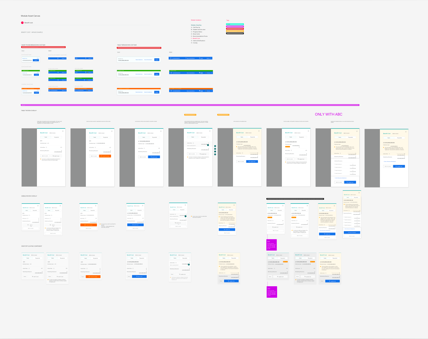
Module asset canvas: benefit cost component across breakpoints and states
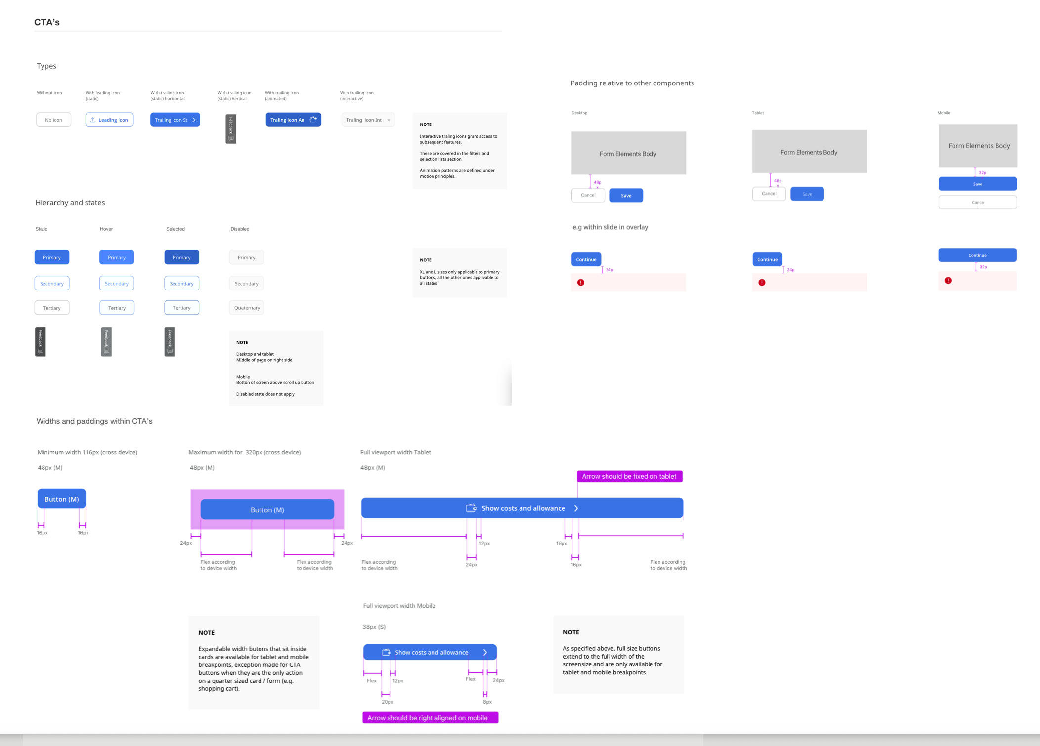
CTA specification: types, hierarchy and states, and the widths and padding that flex across breakpoints
The foundational Design System built for Reward Centre focused on atomic design, breaking the interface down into base components and tokens that could flex across breakpoints. It later iterated during the wider redesign into a Design System family, spanning multiple products; read more in Leading the creation of a design system family.
Testing and delivery
I ran multiple rounds of review sessions with business experts to validate that the flow held up against real plan rules and edge cases, followed by moderated, task-based usability testing sessions with end users across desktop, tablet and mobile, recruited across different benefit engagement levels and geographies (UK, Romania and Singapore), to see whether the interdependency and cart logic actually made sense once someone was working through their own benefits, not just looking at a screen.
Testing insights
Results & Business Impact
Results & Business Impact
A cart that made dependencies visible, on any device.
Employees could finally choose their benefits on any device rather than being tied to a work desktop. Dependencies, changes to existing selections, and mutually exclusive options were made clear, and the cart removed a fifth of the steps to complete selection. Fixing the login and enrolment barriers that had quietly broken along the way also removed the friction that had kept employees from reaching the shopping cart at all.
Fewer steps to complete benefit selection with the shopping cart.
Fewer login-related customer support tickets after the password reset flow was fixed.
Employees able to select benefits on any device: desktop, tablet and mobile.
Selection freed from the desktop
2.5 million employees could choose their benefits from home, on a phone or a tablet, rather than being tied to a work desktop and a single-benefit-at-a-time flow.
Dependencies made visible
The cart surfaced dependencies between benefits, changes to existing selections and mutually exclusive options as they happened, not after the fact.
"It earned me the lead role in redesigning the legacy configuration tool, Control Centre, with buy-in to secure budget for a multinational research programme."
A springboard to Platform
It earned me the lead role in redesigning another tool the legacy configuration and administration tool, Control Centre, with buy-in to secure budget for a multinational research programme on that project.
A Design System, greenlit
It also earned buy-in to create a Design System for this project, later expanded into a Design System family across products.
Supported an acquisition
The work supported the parent company acquisition.